前言这一节继续为大家讲解QML中一些比较有意思的控件。这一节我们要说的控件是导航栏TabBar和工具栏ToolBar。导航栏 TabBarTabBar提供基于选项卡的导航模型,它允许用户在不同的视图或子任务之间切换。TabBar用TabButton控件填充,TabButton可以理解为button按钮控件。TabBar一般会与布局或容器控件一起使用,比如布局管理器或者是我们之前讲过的导航模型SwipeView。属性
附加属性
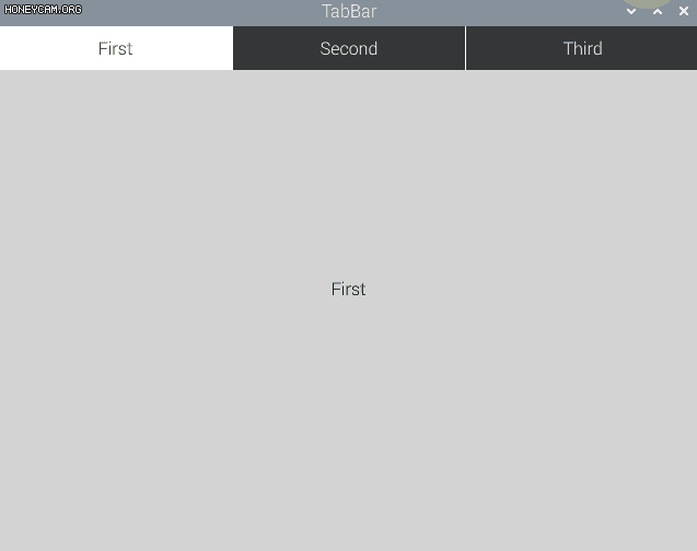
导入控件库,我们还是从两个例程中了解一下TabBar的用法,首先是和布局管理器的结合使用。这个实现效果和之前的SwipeView控件实现的效果类似。 TabBar {
id: bar
width: parent.width
TabButton {
text: qsTr("First")
}
TabButton {
text: qsTr("Second")
}
TabButton {
text: qsTr("Third")
}
}
StackLayout {
anchors.centerIn: parent
width: parent.width
currentIndex: bar.currentIndex
Item {
Text {
anchors.centerIn: parent
text: qsTr("First")
}
}
Item {
Text {
anchors.centerIn: parent
text: qsTr("Second")
}
}
Item {
Text {
anchors.centerIn: parent
text: qsTr("Third")
}
}
}TabBar用TabButton填充,然后在设置一个栈布局管理器,内容也很简单,就是对应着导航栏的名称,设置每个视图上的内容。currentIndex就是当前视图的索引。SwipeView在进行导航时用的是滑动的方法,而TabBar本质是还是一个一个的按钮组成的,点击事件使currentIndex发生变化,而StackLayout提供了一个一次只能显示一个项目堆栈,currentIndex的变化导致当前项目的索引随之改变。
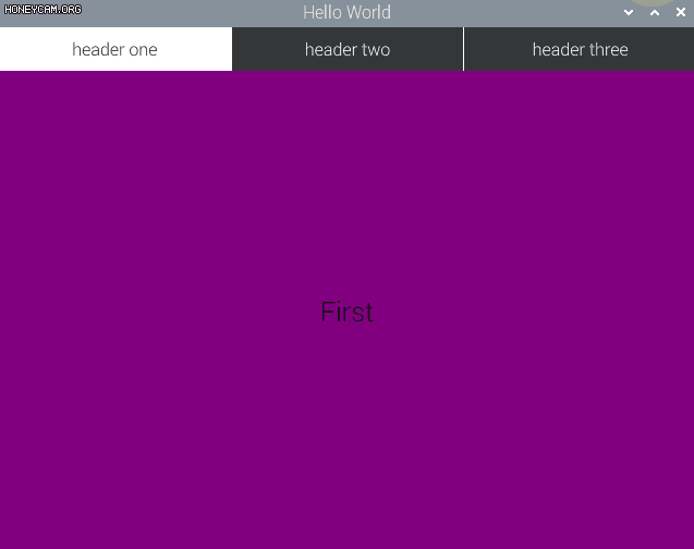
第二个应用是和SwipeView的结合,之前在讲SwipeView这一节的时候,我们对于窗口标题项的设置是Page的页眉页尾,现在我们学习了TabBar控件,所以我们来设置一下窗口标题项header。header是ApplicationWindow的属性,所以我们要把Window窗口元素换成ApplicationWindow。 ApplicationWindow {
visible: true
width: 640
height: 480
title: qsTr("Hello World")
SwipeView {
id: view
currentIndex: 0
anchors.fill: parent
orientation: Qt.Horizontal
interactive: true
Rectangle {
id: firstPage
color: "purple"
Text {
text: qsTr("First")
anchors.centerIn: parent
font.pixelSize: 25
}
}
Rectangle {
id: secondPage
color: "blue"
Text {
text: qsTr("Second")
anchors.centerIn: parent
font.pixelSize: 25
}
}
Rectangle {
id: thirdPage
color: "green"
Text {
text: qsTr("Third")
anchors.centerIn: parent
font.pixelSize: 25
}
}
}
header: TabBar {
id: headertabBar;
currentIndex:view.currentIndex
TabButton {
text: qsTr("header one");
}
TabButton {
text: qsTr("header two")
}
TabButton {
text: qsTr("header three")
}
}
}关于SwipeView的代码就是SwipeView章节中的第一个例程内容,大家不理解的可以参考SwipeView这一篇的内容。设置窗口标题栏,用TabBar为其设置导航选项卡,TabButton填充选项卡的内容。当我们滑动SwipeView时,当前索引currentIndex改变,使得滑动页面可以和标题栏的选择一致。
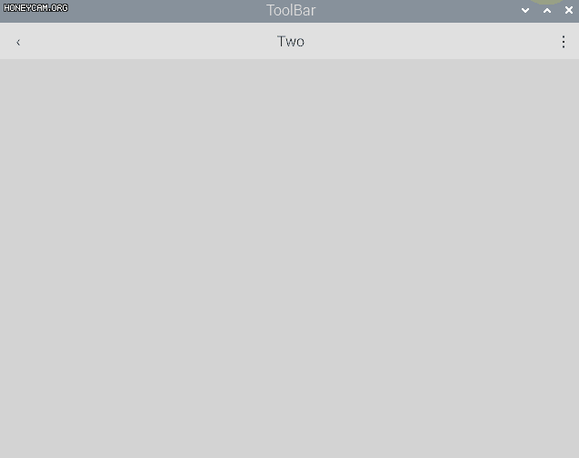
工具栏 ToolBarToolBar主要用于应用程序的上下文控制,就像导航按钮和搜索按钮那样。我们可以打开某一个电脑软件,一般都会有菜单栏和工具栏的。简单理解的也是可以作为窗口标题的。它的属性只有一个就是position——保存工具栏的位置。ApplicationWindow {
visible: true
width: 640
height: 480
title: qsTr("ToolBar")
color: "lightgray"
header: ToolBar {
RowLayout {
anchors.fill: parent
ToolButton {
text: qsTr("‹")
onClicked: stack.pop()
}
Label {
text: "Two"
horizontalAlignment: Qt.AlignHCenter
verticalAlignment: Qt.AlignVCenter
Layout.fillWidth: true
}
ToolButton {
id: fileButton;
text: qsTr("⋮")
onClicked: menu.open()
}
}
}
Menu {
id: menu
x: fileButton.x;
y: fileButton.y;
Action { text: "Cut" }
Action { text: "Copy" }
Action { text: "Paste" }
}
StackView {
id: stack
anchors.fill: parent
}
}看一个官方例程,在窗口标题栏设置ToolBar,同样,ToolBar是用ToolButton来进行填充选项的,因为ToolButton是关联上下文的,所以它的一般用法就是设置一个回退按钮"<",然后还可以设置一个菜单隐藏按钮"⋮",中间的label可以理解为标题名称。 点击回退按钮,可以用之前讲的导航模型SwipeView或者StackView,来进行一个页面的切换,实现上下文的关联。大家可以自行补充StackView的页面进栈出栈。Menu的设置也很简单了,这里就不讲解了。
总结这两个控件的用法大家掌握了吗?可以继续编写自己的自定义控件哦!我们下节再会! |