前言大家想一下,我们日常见到的界面,是不是几乎都有按钮的身影!所以这一节,我们将来学习Qt中的按钮控件类。ButtonButton控件可以说是最常用的控件之一了,用户点击按钮可能会触发pressed,released,clicked信号,这一节中我们要导入上一节中提到的控件库QtQuick.Controls2。import QtQuick.Controls 2.3 第一步还是新建一个Qt Quick工程,然后在window对象中调用我们的Button控件 Button{
id:button
anchors.centerIn: parent
text: "我是按钮"
checkable: true
}运行一下,看界面中间是不是多了一个按钮!其中的属性checkable默认是不选中的,即触发按钮,按下去马上弹起来。当设置为true时,Button变为切换按钮,有两种状态:按下/弹起。 按下按钮,不会有后续的操作,因为我们还没有设置信号槽连接呢,继续添加代码。定制一个自己喜欢的按钮风格。 Button{
id:button
anchors.centerIn: parent
text: "我是按钮"
checkable: true
background: Rectangle{
implicitHeight: 25
implicitWidth: 100
color: button.pressed ? "grey": "green"
border.width: 2
border.color: "slategray"
}
onClicked: {
console.log("哎呀,我被按到了!!!")
}
}运行可以看到,我们定制了一个长度为100,高度为25,边框为2,颜色为slategray的按钮,按钮的颜色按下去有一个颜色的变换,这里用到了信号槽的用法。同样onClicked也是一个信号槽的设置。点击按钮,会输出“哎呀,我被按到了!!!”
选择框控件选择框控件分为单选框radiobutton、多选框 checkbox和分组框groupBox,因为很多属性是相同的,所有我们合到一起讲。如果我们的选项集很多的时候,还可以使用Radio Delegate和Check Delegate控件。RadioBox我们先来说一下ExclusiveGroup(互斥分组),这不是controls2的控件,所以我们需要导入QtQuick.Controls 1.4,ExclusiveGroup本身是不可见元素,用于将一些可选择元素组合到一起,供用户选择其中的一个选项。我们可以在ExclusiveGroup对象中定义Rdiobutton、CheckBox等元素,此时不需要设置她们的exclusiveGroup属性,也可以定义一个只设置了id的ExclusiveGroup对象,在别处定义Rdiobutton、CheckBox等元素时通过id初始化这些元素的exclusiveGroup属性。如果导入controls2,则可以通过GroupBox来实现分组。
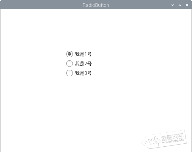
我们通过下面的例子先来来看一下ExclusiveGroup互斥分组。将button部分的代码注释掉或者新建一个工程,输入以下代码 import QtQuick 2.9
import QtQuick.Window 2.2
import QtQuick.Controls 1.4
Window {
visible: true
width: 640
height: 480
title: qsTr("RadioButton")
ExclusiveGroup{
id: exclusivegroup
}
Rectangle{
width: 200
height: 200
anchors.centerIn: parent
RadioButton{
id: radio1
text: "我是1号"
checked: true
exclusiveGroup: exclusivegroup
}
RadioButton{
id: radio2
anchors.top: radio1.bottom
anchors.topMargin: 10
text: "我是2号"
checked: false
exclusiveGroup: exclusivegroup
}
RadioButton{
id: radio3
anchors.top: radio2.bottom
anchors.topMargin: 10
text: "我是3号"
checked: false
exclusiveGroup: exclusivegroup
}
}
}定义了3个单选框,因为还没有学习布局管理的部分,所以将这3个单选框放到了一个矩形中,采用锚定位的方式anchors.top简单管理一下位置。定义ExclusiveGroup对象,然后在RadioButton中设置exclusiveGroup属性,这样就可以实现单选框之间的互斥选择了。 运行看一下效果。
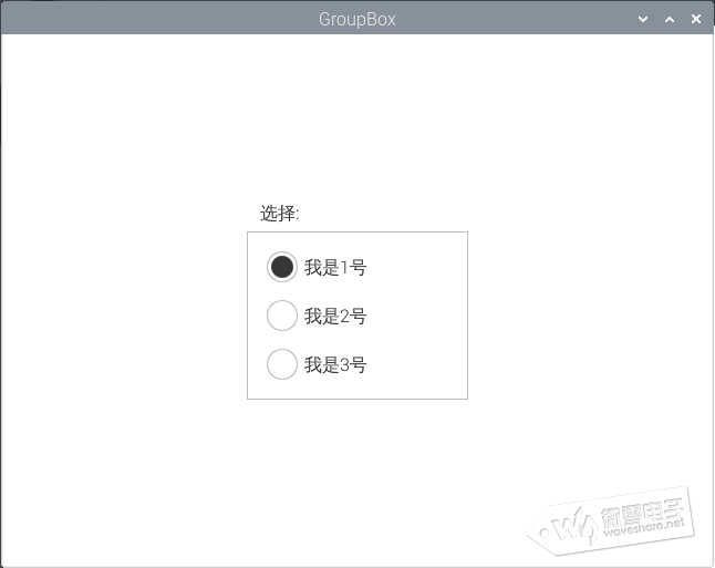
GroupBox注释掉当前的代码,采用GroupBox的方式对单选框有一个分组。 import QtQuick 2.9
import QtQuick.Window 2.2
import QtQuick.Controls 2.3
Window {
visible: true
width: 640
height: 480
title: qsTr("GroupBox")
GroupBox{
id: groupbox
title: "选择:"
width: 200
height: 180
anchors.centerIn: parent
RadioButton{
id: radio1
text: "我是1号"
checked: true
checkable: flase
}
RadioButton{
id: radio2
anchors.top: radio1.bottom
anchors.topMargin: 4
text: "我是2号"
checked: false
}
RadioButton{
id: radio3
anchors.top: radio2.bottom
anchors.topMargin: 4
text: "我是3号"
checked: false
}
}
}对比可以发现,其实RadioButton部分的定义属性都是一样的,只不过我们是将其定义在了GroupBox对象中。RadioButton也可以自定义style,使用方法和button一样,属性也差不多,只是在controls1中,需要导入QtQuick.Controls.Styles模块。 import QtQuick.Controls.Styles 1.2 我们运行程序,和上一种方法对比一下效果。
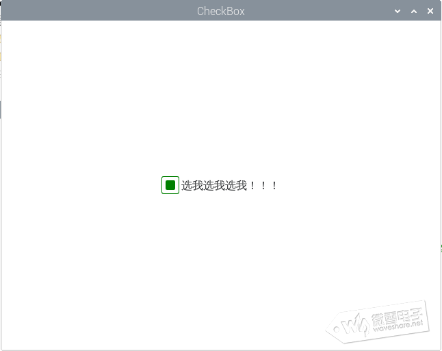
CheckBoxCheckBox的用法和RadioButton差不多,我们就不强调它的使用了,主要是讲一下没讲到的控件自定义的部分。controls1和2的对于style属性的使用略有不同,大家自行查看一下用法,我们这里举一个官方文档的例程。 import QtQuick 2.9
import QtQuick.Window 2.2
import QtQuick.Controls 2.3
Window {
visible: true
width: 640
height: 480
title: qsTr("CheckBox")
CheckBox{
anchors.centerIn: parent
id: control
text: "选我选我选我!!!"
spacing: 3
indicator:Rectangle{
id:rectangel1
implicitWidth: 26
implicitHeight: 26
x: control.leftPadding
y: parent.height / 2 - height / 2
radius: 3
border.color: control.down ? "orange" : "green"
Rectangle
{
id: rectangle2
width: 14
height: 14
x: 6
y: 6
radius: 2
color: control.down ? "orange" : "green"
visible: control.checked
}
}
}
}定义了两个矩形,属于包含的关系,rectangel1为一个26*26的正方形,位置在checkbox的中心,边缘圆滑度为3,当点击复选框时颜色变为橘黄色,注意哦!不是选中了改变颜色,而是按下去改变。接着在大矩形内部定义一个小矩形,长宽起始位置设置好,填充颜色也是按下去改变。最后的属性visible,是可视化属性,CheckBoxc的hecked属性默认是flase(不选中),当选择复选框以后,visible随之可视。
总结源码:7.zip |
